I made a Github page with most of the backgrounds uploaded here and in the backgrounds discussion page, if anyone wants me to remove their’s from the repository just let me know and I can remove it (since only a couple of them are actually mine)
6 Likes
Wow there are some really nice ones in there @martiandeath!
Before i even try, do i have your permission to create a custom KDE login theme with some of your wallpapers?
1 Like
@TCH yeah I don’t really mind what people do with the ones I made, I don’t really know how to do those kinda of things so go ahead
2 Likes
Made an animated version of this awesome graphic from one of the blog posts:
16:9 cropped GIF
Original size, uncropped webm:
24 Likes
RTR

This picture is scaled by 3x (after smoothing out all the jpeg compression loss), so the edges are jagged. Someone needs to smooth them out.
This picture is also standard 9:16 (or 10:16) but you can crop it to fit frameworks’ screen. There is a 1-pixel vertical line (at the bottom edge) and a 1 pixel horizontal line to define the “center”.
This picture only contains two colors. You can change the background/foreground by editing this picture with Microsoft Paint (or other simple picture editors) and use “fill with color” tool.
11 Likes
The closest I have ever seen is the symbol of “the ethernal engine” from the WarHammer 40K universe.

It wouldn’t really work, because either the hand need to appear too big (to be able to grab the wheel) or the wheel to be too large (to not have too much curvature) so the hand can grab it.
WH’s instance emphasize the hand. Quite weird considering the usual of emphasizing the gear (symbol of mechanicus adaptus)
However, the shape of framework’s logo is actually of great intrigue. The outside “tooth” resemble something like the Torx Plus, however the central “knob” suggest something like “security torx plus”, which in reality is 5 sided.
3 Likes
I have a few ideas in mind! I think the results will be good ![]()
1 Like
Well, I whipped this up during class today… The colors are just for separating the layers. This is an SVG with layers embedded (I think) so you should be able to edit this as you wish.
The real purpose of this is that the hand and wrench were penned out by hand as vectors instead of pixels.
I hope this is useful for anyone else wanting to use this image.
SVG Link
PNG below:

16 Likes
Yeah but…
Shouldn’t it have the Screwdriver?
3 Likes
This is tremendously useful because you vectored my wrench logo
Which is supposed to be a svg but I can not find it absolutely anywhere (and you would have thought that the right to repair movement would have created a symbol to put on their waving flags)
however you removed the ring around it so ![]()
Can you private message me with a vectorized hand wrench thing
Yes, but it was what that end up on places like iFixit’s posters and stickers, so I never questioned it.
It’s more about the belief that everybody has the right to do whatever they want to extend the lifetime/performance window of whatever they owns and the company can’t point their finger and void the warranty
Cars are among the first to have some sort of consensus (you can have your tires, brakes and engine repaired by anyone and there’s not really anything called warranty)
Apple was perhaps the most notorious in the fact that you are not able to get your (old) iMacs motherboard fixed even if you are willing to pay $2K and drive to an Authorized Service Provider because they just don’t do it, as seen on LTT Youtube
And how they will do things like tying Intel Xeons to motherboard even if the CPU is a modular unit and can be swapped
2 Likes
Oh wow - mine was totally an off-the-cuff remark…
I was just thinking that it was a cool symbol but could be even more Framework specific.
1 Like
It could. It was just a arm holding an adjustable wrench and I was explaining why it was designed like this
And that’s why I wrote “RTR” because it is
You can alter it to hold a screwdriver instead, but it might be too tall (since usually you hold screwdrivers by the handle and there is a bit sticking out). However, framework have a tall display, so… eh. there you go.
I can probably do that, but I am very busy with school work, and I am not too good at high resolution raster and haven’t tried vector graphing yet.
1 Like
Me?? Old-school LOL
I’ve got the artistic ability of a slug…
2 Likes

I made this a few weeks ago after a friend asked me to. I first showed it to the the Framework Discord and thought I should share here…
It’s a mix of an AI-generated image, an oil painting, the framework logo, and free time.
9 Likes
damn, frameworkers made it wholesome
1 Like

Philips #1 version
I … uh … hm. yeah.
There is a lot of “artifact” from patching the circles and stuff. If you guys like it I will “transplant” sections, polish and scale it up
I can see. The background (and some other otherwise blank areas) are a beautiful mix of color, yet it describes absolutely nothing. It’s not a mountain, it’s not plains, sky, sea, island, people, trees.
There’s lot of flashing purple things like you would expect from a setting closer to Cyberpunk 2077 than … a symbol of anything, really.
7 Likes

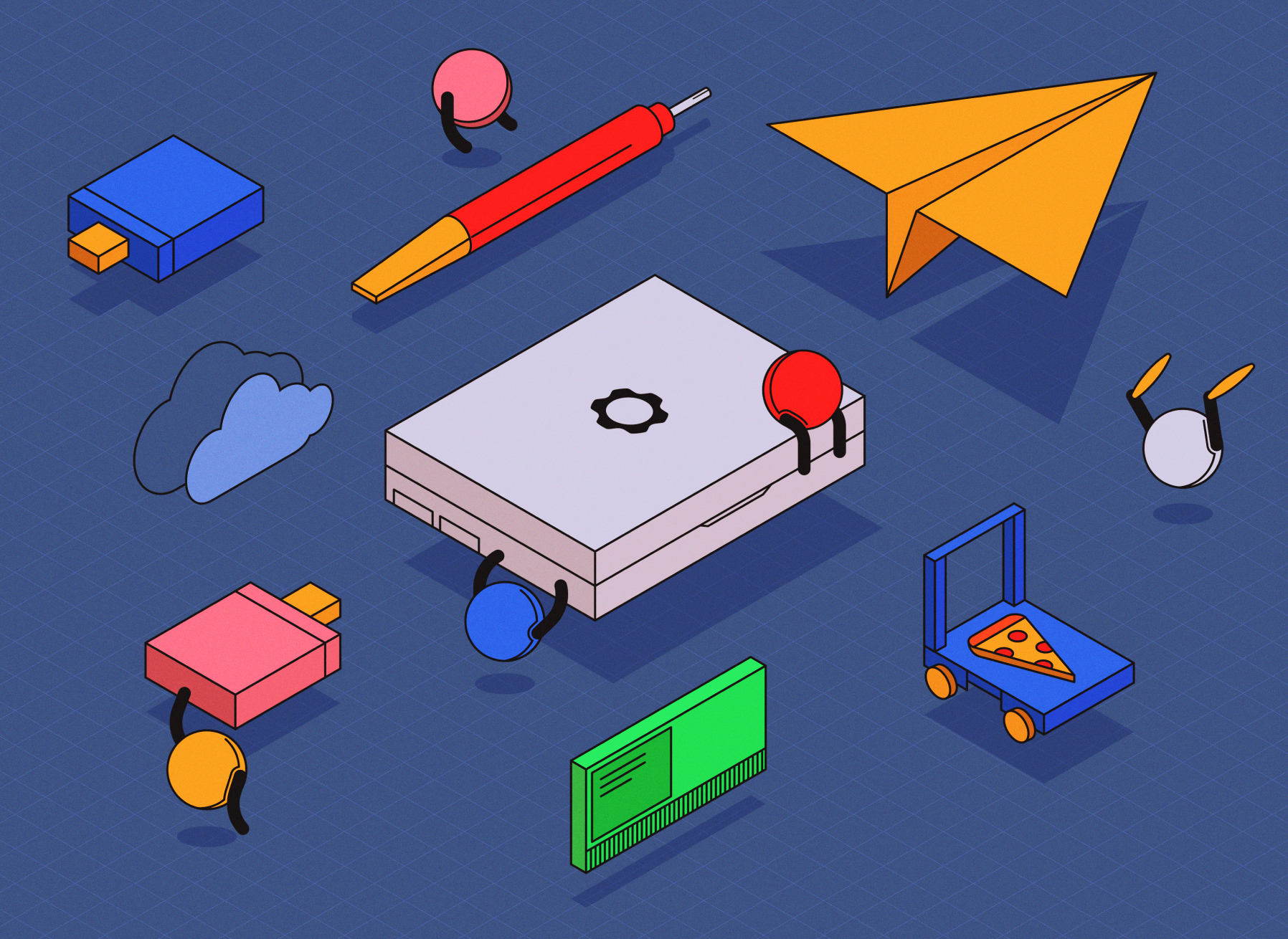
i made this as a concept of what a gaming laptop might be. credit to Nev from the framework discord server for the custom laptop
7 Likes
I love the “Gamework” thing at the top. The feaux-partnerships actually seems almost reasonable, too! Fantastic concept
2 Likes
