Site Favicon Hard to See on Dark Browsers

Is there any chance that the favicon for the Framework site could either get a version that displays on dark-mode browsers or a little boarder added around it so that it can be seen? It’s not really a big problem, but just a quark I notice every time I see the tab.

Example:
image

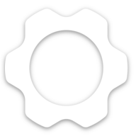
My attempt at a fix Might be too aggressive on the outer border:
image
image

It seems that Framework themselves have a favicon that would be suitable for dark themes already on their site. Maybe it just requires some implementation: https://frame.work/favicon-192x192.png

I have sent an email to support re that :slight_smile:

My solution was to change the colour of the #navbar via userChrome in Firefox

favicon

2 Likes

That’s a good idea but I’m not going to change my navbar color to accomidate one site.

Not just that. I like it dark but not all shades of grey :slight_smile: and there other favicons that are questionable.

I did try an alternate icon as you had, I used one from this site but ended up with a background change.

Here are a couple of png files.

128x128px f1h

rotated 30° f1v


and of course there is the

the official