Hi, I like the Swedish keyboard but i have some thoughts.
I really, really want you to not have a Windows logo on the super key.
Please use one of the following symbols: Framework logo, Unicode U+2318 ⌘, or use the text “Super”.
A thought that just would be nice is to swap places of ? and \ on the + key to make the keyboard consistent with {} () on the 7,8,9,0 keys. Just to make it look good
Swiss looks good. but keep in mind that we have 3 different languages and thus 3 different swiss keyboards. You showcased the german one also known as de_CH
We also see additional feedback from folks on font changes for Thai. I wanted to see if there are any other recommendations from folks on this one way or another.
As previously stated a couple of times, OEMs usually group the nordic countries into one layout with quite crowded umlaut keys, Personally i would like 3 separate keyboards because i quite dislike the crowded buttons.
However i would assume that making a unified layout for nordic countries would be cheaper for FW.
In the end i’m personally not too bothered about this specific issue, do what makes most sense.
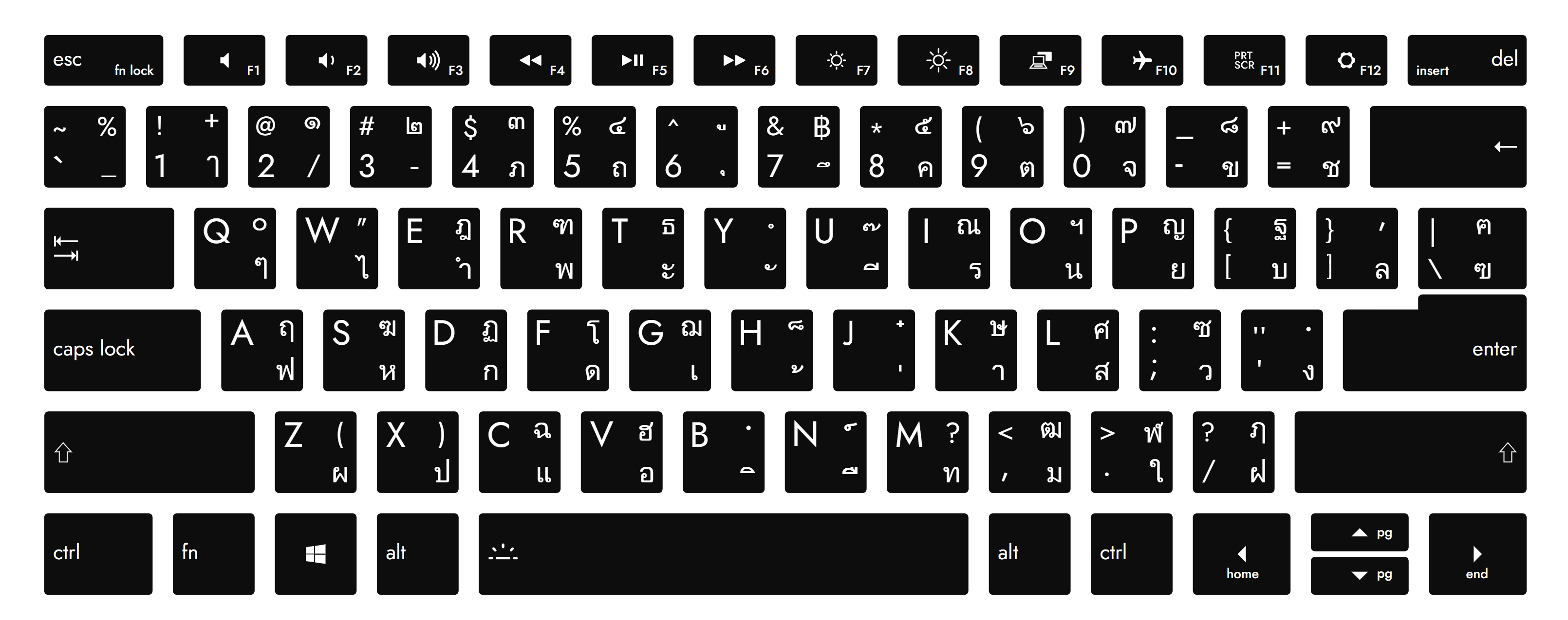
as @New_Customer mentioned, the l and I looks like it’s a little bit thicker then its supposed to be? hopefully that’s just an issue with the scaling for the picture and wont look as strange on the actual product.
The M key is missing the µ sub-character on the nordic keyboards (i can say i’ve only used this key a handful of times in my entire life so i’m not sure how important it is)
on nordic keyboards we have 2 ways of creating a € sign, either “alt + E” or “alt + 5”. I’m not sure if we want the € character on two keys so close to each other, or follow the standard with € subcharacter on E and ONLY % on the 5 key, or switch it up with the € subcharacter on the 5 key following the £ on 3 key and $ on 4 key pattern
Happy to see you are preparing for a Scandinavian release.
It is, to my knowledge, rather common to avoid the full English functional terms on European keycaps. For example, the current Framework keyboard for French has no English words on it at all, except for the abbreviated prt scr and fn lock. The other abbreviations (fn, ctrl, etc.) are translingual.
I believe the French approach is correct for the Scandinavian keyboards as well, where full words are either replaced by icons or by translingual or conventional abbreviations. Apple has managed to replace everything except esc with icons; here is their current Danish keyboard with a numeric pad:
As such, I suggest the following changes to the Scandinavian keyboards:
caps lock → ⇪
insert → ins
fn lock → fn or a symbol with fn inside a lock
I am leaning towards removing home, end and pg entirely and leaving the secondary functions implied. Alternatively:
home → ⇱ or ⤒
end → ⇲ or ⤓
pg can either be replaced with ↑/⇞ and ↓/⇟ in addition to the current arrows (meaning two arrows on a single keycap, which is clunky but consistent) or stay as a conventional abbreviation
While the rest of these changes probably vary by preference and can be left up to the product designers, at least caps lock → ⇪ is, in my opinion, the most universal and correct choice.
For us in Finland, the Swedish keyboard is I guess the right one. But I have nothing against the Pan Nordic one as well, that is what I’m typing with at the moment as well.
Oh man, I’m so excited hopefully to be able to order these in Finland as well! Used to live in Germany and have one 13" already, but I’m already itching to order one 16" and recommend this to everyone that just listens to me.
The swiss layout seems fine…
As mentioned above, it has to work for several languages (german, french, italian and romantsch). Some layouts choose to show some letters bigger than others to make it more intuitive to use (äöü for ch_de, éàè for ch_fr). The layout you chose has them all the same size - and should suit the whole swiss-market…
@Haldi: because there is swiss-german and swiss-french which affects primary assignment of these buttons. French uses éèà while german uses öüä so the upper row is swiss-french and lower row is swiss-german.
And regarding the brackets which @Deine_Kaufkraft_UG mentioned earlier which are different on Lenovo: on my Dell XPS13 it’s the same layout like in the image from Framework. For me it looks much cleaner with the bracket next to it. The Lenovo-style looks kind of squeezed in for me.
Please, just dont.
That looks so damn Stupid.
99% of People who buy a FrameWork are Tech Savey, they’ve probably used Keyboards for quite some time and use them Blind and not by Reading whats on the keys.
For those People that DON’T, well, those are NOT the kind of people that actually know where the Shift button is on the Keyboard or if the “upper” or “lower” character actually has to be pushed with shift. So the just press the key, oh wrong, Backspace and press it with shift again.
So except from looking really really ridiculus there is actually 0 benefit.
Except for people with OCD…
Even though I do touch typing, I’d like to formally exclude myself from tech-savvy buyers. I prefer my keys to not be naked.
The Danish one is looking great btw, I won’t use it as I’ve switched to ANSI layout. but I compared it to my old Nordic keyboards & it seems everything is where it needs to be.
I understand it’s looking strange in the first moment. But on the other hand this keyboard layout is set down in a standard. Please stick to standards if available, it makes every lifes easier.
Then they don’t mind the printing on the keys anyway


